Bad UI
User interface is the most important feature of all devices (and software). It exposes all device functions to the user. Without user interface, all features of the device would be useless.
Apparently companies who have been around for tens or even hundreds of years are still making mistakes in user interface design. Here are two examples.
The compartment under the center armrest in a very popular car looks like this:
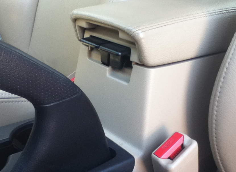
The compartment has two levels. Hence there are two levers under the armrest. One of them opens the top, flat compartment, the other one opens the bottom, big compartment. Unfortunately I am not able to memorize which lever opens which compartment.
I used to keep a box of kleenex/tissue in the bottom compartment. Whenever I wanted to take one tissue out, I had to guess which lever to pull to open the right compartment. And somehow I always guessed wrong. Very annoying, esp. during driving.
Cars are known for very well-thought user interfaces, which don’t get in the way. But in this case – they blew it.
Here is another example of a bad user interface. This company making all kinds of appliances and house equipment has been around for more than 100 years. One of their stoves:
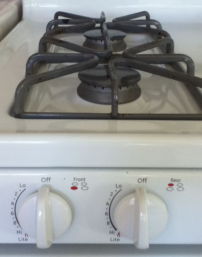
This is a standard piece of equipment and a standard user interface solution. Well – nothing less annoying. The flaw here is almost the same as in the case of the dual compartment above. There are two knobs, one for each burner. Unfortunately the burners are aligned vertically, while the knobs are aligned horizontally, giving you no clue (without taking a closer look) which knob is for which burner.
In order to tell which knob is for which burner, I have to bend. Often I don’t want to bend, I just want to turn the burner on. When I don’t bend and look at the pictures which decipher the knob-to-burner assignment, I always choose the wrong knob and turn the wrong burner on. Like in the dual compartment case, it is not possible to memorize which knob is for which burner. Maybe because the pair of knobs on the other side for the two remaining burners is swapped. Well, at least they left a visual clue for the people who are not too lazy and actually bend or take a step back to determine which knob to turn. Please note, that when you’re close to the stove and e.g. putting a kettle on the back burner, you don’t see the icons over the knobs and you either have to bend down or back or you have to take a step back.
As innocuous as they may seem, these can be quite annoying.
How many broken UI designs can you spot around you?

You missed the biggest of them all: inserting devices in the USB slot.